Display Advertising
DeVry Blog Project - Week 5 | 1/31/17
This week, I'm exploring the different options available for advertisers that are looking for branding and awareness opportunities. This may seem like a bit of an assumption, but the purpose of the following display advertising formats is to create as many cost-effective impressions as possible. On Google, the advertiser is only charged for each engagement with an advertisement. This is much like a PPC campaign, where the advertiser is only charged for each click on a campaign that leads to their landing page.
Below are the three examples of Lightbox display ads that are provided by DoubleClick Studio via Google. As mentioned in our book Internet Marketing (2013, Roberts), these are known as Rising Stars or Rich Media Branding Units. These screen grabs are from various stages of the ad being displayed, on various mediums.
Example 1: Mobile Lightbox ad, pre-engagement
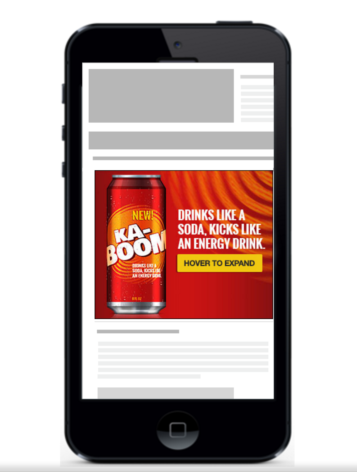
This version of the ad hasn't charged the advertiser for any engagement because the user hasn't clicked on the ad. Also, on mobile and tablet, the call to action on the banner will be changed to "tap to expand" instead of "hover to expand". The content of the landing page is grayed out and is partially displayed behind the Lightbox Ad. In the next example, I'll show what happens if the user engages with the call to action.
Example 2: Tablet Lightbox ad, post-engagement

Example 3: Desktop Lightbox Ad, pre-engagement

Again, we see the ad on the left, before the user engages. However, on desktop, this only requires a hover over rather than a direct click. It also doesn't require the user to exit out, it appears on the page instead of a pop-up style ad. General guidelines are that a user has to hover over for 2+ seconds for the ad to expand into the video experience that's seen in example 2, so the advertiser is not charged for an unwanted engagement.
In all of these examples, Google requires the advertiser to submit banners in certain formats to display correctly on different platforms. A guideline of best practices for banner and display ads can be found below.
IAB Ad Content Guidelines
How does this all work?
Google has a stronghold on this type of advertising because they supply the network (known as the Google Display Network), where thousands of partner sites can display a banner or display ad that is relevant to you. If you've ever wondered why you get display advertisements that are completely unrelated to the content you are browsing, it is because the site is a partner on a display network, and your demographics and browsing behavior have put you into the desired target for the advertiser.Real Life Example
None of the sites I'm following have any display or banner ads, nor do they have any event triggered ads. However, I do remember a shopping experience before Christmas that stuck with me. My reaction was mostly negative, and I'll explain why. The example was completed in incognito mode, so no previous browsing sessions nor cookies were stored. This is to get the user experience from the first time customer's point of view.
Below is a SERP for the search query "omaha steaks". Completely unrelated, but I will always be interested in the slight differences in copy from the SERP ad, and the organic result. The research and psychology of what sitelink extensions and call to action provide better results that show the slight differences in wording is amazing. Side note- Omaha Steaks uses Google Shopping to offer some of their best deals.

Moving on- I clicked the PPC ad to get to the Omaha Steaks home page (not sorry). Within 2 seconds of landing, an event occurred. I believe this is coded in the Javascript, and I'm still unsure of the technical term of this. I call it a modern day pop-up ad, and it's captured below.

Personally, I hate this trend and I secretly hope that search engine algorithms start to account for the bounces associated with these pop-ups. As we move through the purchase funnel, this continues to be a theme. I closed the window to add my e-mail address, and added the first item on the landing page to my cart. Here is the result of that action.

Another pop-up! This one with a different objective in mind. The first was a new customer acquisition, with the call to action being inputting an email address in exchange for a special deal. This pop-up was an upsell/add-on attempt.
I click "no thanks" and continue to the check out screen. Here is what follows:

There are two more upsell/add-on attempts, but not via a pop-up. The top banner attempts to sell side dishes. There is an additional banner at the bottom that is offering me burgers. At this point, I cannot continue without converting, so I must abandon my cart.
Also, I recreated the same process on my phone. The user experience is the same on mobile in terms of pop-ups and add-on offers. However, their site is mobile optimized, and all banners/pop-ups fit the screen nicely, even when rotated.
Even though my experience was poor due to excessive pop-ups, add-ons, and banners, these tactics must deliver great retention rates from other users. It would be interesting to see the conversion rates for the special offers, and how much return is provided from these efforts vs. exit rates.
Roberts, M. L. (2013). Internet Marketing: Integrating Online and Offline Strategies, 3rd Edition. [Bookshelf Online]. Retrieved from https://online.vitalsource.com/#/books/9781285827261/
No comments:
Post a Comment